+psdef//antialias+true+psdef//color_smoothing+null+psdef//apcp/0/300/plotrange/S/last/plotvalue//plotaxislength+250+psdef+.gif)
Visual features of the map interface The map first displays the most recent six-day total precipitation percentile forecast. Users may also use the map viewer to:
Select the map of interest There are radio buttons on the left side of the page under "Map Selection".
Zoom map in/out There are two ways to zoom the map to different regions; the click-and-drag option and the latitude/longitude text boxes. Note that the map can not display areas outside of the latitudes initially shown on the interface (~66.25°S - 76.25°N).
Select Forecast Start Time When the six-day total forecast maps or the IRI seasonal forecast or PiC maps are chosen, a text box and buttons will appear above the map that allow the Forecast Start Time (or Month Forecast Issued) to be selected. The Forecast Start Time for the map currently being displayed appears in the text box.
To step forward or back by one time step (by one day for the Six-Day maps and one month for the IRI forecast maps), click the corresponding buttons next to the text box.
One may also modify the date in the text box, using the appropriate format (e.g. "0000 16 Jan 2008", for the six-day maps; "Jan 2008" for the IRI forecast maps), and then click the "Redraw" button to go to the forecast issued on that date.
To produce an animation of these maps over a series of dates, in the "Forecast Start Time" text box include a beginning date for the animation followed by "to", followed by the ending date, and click the "Redraw" button. For example to see an animation of six-day forecasts from the 0000 1 Jan 2008 to the 0000 15 Jan 2008 starting dates, type in "0000 1 Jan 2008 to 0000 15 Jan 2008" and then click "Redraw".
Interpreting the maps The following sections provide some explanation regarding the correct interpretation of each of the maps available in the interface.
ESRL GEFS Six-Day and Daily Precipitation Forecast MapsThe Earth System Research Laboratory (ESRL) Physical Sciences Division (PSD) Reforecast Version 2 Project has produced a dataset of historical weather forecasts generated with a fixed numerical model, using the 2012 version of the National Centers for Environmental Prediction's (NCEP) Global Ensemble Forecasting System (GEFS). This Reforecast Version 2 dataset consists of an 11-member ensemble of forecasts, produced on a daily basis from 00 UTC initial conditions for the period December 1984 to the present. The horizontal resolution of GEFS is T254 (about 50 km) out to 8 days, and T190 (about 70 km) from 8-16 days. In this application, data interpolated to 1.0° lat/lon spatial resolution are used. The result is a stable model climatology of forecast variables from December 1984 to the present, including accumulated precipitation. You can find more information on the ESRL Reforecast Version 2 Project at the following website: ESRL Reforecast Version 2 Project
Reference: Hamill, T. M., J. S. Whitaker, G. T. Bates, D. R. Murray, M. Fiorino, T. J. Galarneau, Jr., Y. Zhu, and W. Lapenta, 2013: NOAA's second-generation global medium-range ensemble forecast data set. Bull. Amer. Meteor. Soc., in press.
In the current application of these forecast data, no adjustments have been made to account for model biases with respect to the real atmosphere. However, using this fixed climatology, self-consistent forecast precipitation statistics, including daily anomalies, percent of mean monthly total precipitation, and precipitation percentiles, have been computed to put the daily and six-day forecast precipitation totals into historical context. All the precipitation forecast maps shown are derived from daily ensemble mean precipitation values. Maps based on the forecast of six-day total precipitation may be selected and displayed in the main window of the interface. Maps of forecast single-day precipitation for days 1-6 are available via hyperlinks in the table entitled "Single-Day (24-Hour) Total Precipitation Forecast Maps" found below the main interface window.
Since the spatial resolution of the forecast precipitation values from the forecast model is 1.0° lat/lon, the forecast totals and statistics represent values for large-scale precipitation. Although these maps should, in general, be able to identify regions of large-scale heavy cumulative rainfall associated with tropical cyclones, for instance, they should not be used for forecasting cyclone tracks or the intensity or location of intense fine-scale or localized precipitation (associated with orography, for example).
ESRL GEFS Six-Day Total Forecast Precipitation
ESRL GEFS Six-Day Total Forecast Precipitation Anomaly
+psdef//antialias+true+psdef//color_smoothing+null+psdef//apcp/0/300/plotrange/S/last/plotvalue//plotaxislength+250+psdef+.gif)
ESRL GEFS Six-Day Total Forecast Precipitation Percentile
+psdef//antialias+true+psdef//color_smoothing+null+psdef//apcp/0/300/plotrange/S/last/plotvalue//plotaxislength+250+psdef+.gif)
ESRL GEFS Six-Day Total Forecast Precipitation as Percent of Mean Monthly Total
+psdef//antialias+true+psdef//color_smoothing+null+psdef//apcp/0/300/plotrange/S/last/plotvalue//plotaxislength+250+psdef+.gif)
IRI Seasonal Precipitation Forecast

The forecasts provide probabilities that the seasonal precipitation will be in the lowest one-third of the climatological distribution (lowest tercile), the middle one-third (middle tercile), or the highest one-third (upper tercile). In order to show the probabilities using only one map, the probability of the category having the greatest probability (33.3% or greater) is shown by color shading; variations in the shading in the lower and upper terciles indicate the strength of the probability. Areas in grey indicate that the near-normal category is most likely. Areas in white indicate the climatology forecast (33.3% for each tercile), in which case no tercile is dominant. The climatological distribution is determined by the observations for the season in question over a recent 30-year history. The forecasts represent a distillation of information from a number of inputs, the most important being the predictions of several dynamical atmospheric prediction models that respond to the expected patterns in sea surface temperature (SST).
You can find more information about the IRI seasonal forecasts at the following pages: IRI Net Assessment Forecasts, Map Room Forecast page, Data Library entry.
Reference: Barnston, A. G., S. J. Mason, L. Goddard, D. G. Dewitt, and S. E. Zebiak, 2003: Multimodel ensembling in seasonal climate forecasting at IRI. Bull. Amer. Meteor. Soc., 84, 1783-1796.
IRI Seasonal Extreme Precipitation Forecast

The forecast provides probabilities that the seasonal precipitation will be in the lowest fifteen percent (15%) or the highest fifteen percent of the climatological distribution. In order to show the probabilities using only one map, the probability of the category having the greatest probability is shown by color shading; variations in the shading indicate the strength of the probability. Light/medium/dark blue colors indicate a slightly enhanced/enhanced/highly enhanced probability (25%-40%/40%-50%/over 50%) of seasonal precipitation in the highest 15% of the climatological distribution. Gold/brown/dark brown colors indicate a slightly enhanced/enhanced/highly enhanced probability (25%-40%/40%-50%/over 50%) of seasonal precipitation in the lowest 15% of the climatological distribution. The climatological distribution is determined by the observations for the season in question over a recent 30-year history. The forecasts represent a distillation of information from a number of inputs, the most important being the predictions of several dynamical atmospheric prediction models that respond to the expected patterns in sea surface temperature (SST).
You can find more information about the IRI seasonal forecasts at the following pages: IRI Net Assessment Forecasts, Data Library entry.
Reference: Barnston, A. G., S. J. Mason, L. Goddard, D. G. Dewitt, and S. E. Zebiak, 2003: Multimodel ensembling in seasonal climate forecasting at IRI. Bull. Amer. Meteor. Soc., 84, 1783-1796.
IRI Predictions in Context (PiC): Same Tendency in Seasonal Forecast and 3-Month Precipitation Observation

NCEP gridded monthly precipitation data for 30 years (1969 to 1998) are used as the observational data reference. CAMS-OPI monthly gridded precipitation is used for the observations for the past 3 months. First, the rainfall observation for the most recent 3 months at each gridpoint is ranked on a 0 to 1 scale, with 0 as the driest event in 30 years for the same 3-month period, and 1.0 as the wettest event. A value of 0.333 and less is considered dry (below-normal), and a value of 0.667 and greater is considered wet (above-normal). Secondly, the forecast for the next season for the same location is examined. A forecast with a 40% or greater probability for the below-normal category is considered an enhanced likelihood of dry forecast, and a forecast of 40% or greater for the above-normal category is considered an enhanced likelihood of wet forecast.
Based on the observation and forecast, a map is produced representing areas with enhanced likelihood of continued wetter- or drier-than-average conditions. The maps' relative likelihoods of persistence are indicated for either wet or dry, depending upon whether the forecast probability is 40-50% (labeled "Enhanced"), or 55% and higher (labeled "Greatly Enhanced"). Therefore, areas in light yellow (light green) indicate locations where precipitation in the past season was below normal (above normal) and the forecast indicates an enhanced likelihood of continued below-normal (above-normal) precipitation in the next 3-month season. Areas in dark yellow (dark green) indicate locations where precipitation in the past season was below normal (above normal) and the forecast indicates a greatly enhanced likelihood of continued below-normal (above-normal) precipitation in the next 3-month season.
For more information on this analysis, see the following pages: Predictions in Context, Map Room PiC page, Data Library entry.
IRI Predictions in Context (PiC): Reversed Tendency Between Seasonal Forecast and 3-Month Precipitation Observation

NCEP gridded monthly precipitation data for 30 years (1969 to 1998) are used as the observational data reference. CAMS-OPI monthly gridded precipitation is used for the observations for the past 3 months. First, the rainfall observation for the most recent 3 months at each gridpoint is ranked on a 0 to 1 scale, with 0 as the driest event in 30 years for the same 3-month period, and 1.0 as the wettest event. A value of 0.333 and less is considered dry (below-normal), and a value of 0.667 and greater is considered wet (above-normal). Secondly, the forecast for the next season for the same location is examined. A forecast with a 40% or greater probability for the below-normal category is considered an enhanced likelihood of dry forecast, and a forecast of 40% or greater for the above-normal category is considered an enhanced likelihood of wet forecast.
Based on the observation and forecast, a map is produced representing areas with enhanced likelihood of reversed precipitation tendency in comparison to the previously-observed 3-month precipitation. Areas in yellow indicate locations with observed above-normal precipitation, but with an enhanced likelihood of below-normal precipitation in the coming season. Areas in green indicate locations with observed below-normal precipitation in the previous season, but with an enhanced likelihood of above-normal precipitation in the coming season.
For more information on this analysis, see the following pages: Predictions in Context, Map Room PiC page, Data Library entry.
CPC Merged Analysis of Precipitation (CMAP) Monthly Climatology

Reference: Xie, P. and P. A. Arkin, 1997: Global precipitation: A 17-year monthly analysis based on gauge observations, satellite estimates, and numerical model outputs. Bull. Amer. Met. Soc., 78, 2539-2558.
CIESIN/SEDAC GPWv3 Year 2005 Projected U.N.-Adjusted Population Counts
This map displays an estimate of the projected number of people living in each 2.5
arc-minute grid box in the year 2005. The data shown are from the CIESIN Gridded Population
of the World, Version 3 (GPWv3) data set. Values are derived from national statistical office estimates of population
and adjusted according to U.N. national population estimates. You can find more information
on this data set at the following site: Gridded Population of the World, Version 3.
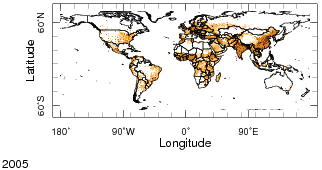
Citation: Center for International Earth Science Information Network (CIESIN), Columbia University; United Nations Food and Agriculture Programme (FAO); and Centro Internacional de Agricultura Tropical (CIAT). 2005. Gridded Population of the World: Future Estimates (GPWFE). Palisades, NY: Socioeconomic Data and Applications Center (SEDAC), Columbia University. Available at http://sedac.ciesin.columbia.edu/gpw/.
CIESIN/SEDAC Global Distribution of Poverty, Infant Mortality Rate, Year 2000
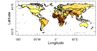
More information on this poverty indicator and the full data set can be found at the following site: Global Distribution of Poverty.
Citation: Center for International Earth Science Information Network (CIESIN), Columbia University; 2005 Global subnational infant mortality rates [dataset]. CIESIN, Palisades, NY, USA. Available at: http://www.ciesin.columbia.edu/povmap/ds_global.html
Please feel free to email us with any questions or comments.