
International Fund for Agricultural Development
This suite of maprooms provides climate information and decision support tools to enable poor rural women and men farmers and policy makers to better manage the risks associated with climate variability and change. Better management of such risks will allow farmers to increase agricultural production and productivity and will enhance food security and rural livelihoods in test sites in Indonesia, Lao PDR, and Bangladesh.
Click the tabs (top right) for links to the following useful maps:
- Historical Weather-within-Climate: These maps explore historical daily precipitation or temperature by calculating relevant seasonal statistics.
- Probabilistic ENSO Composites: These maps explore historical daily precipitation seasonal characteristics conditioned to ENSO phases.
- Experimental Regional Seasonal Forecast: Theses maps show seasonal precipitation forecasts using GCM forecasts and regional observations datasets.
- Six-Day forecasts: These maps show where heavy rainfall is expected in the next six days, and how much rainfall is expected.
- Probabilistic Seasonal Forecast: These maps show where large or small amounts of rainfall are expected in the next three months.
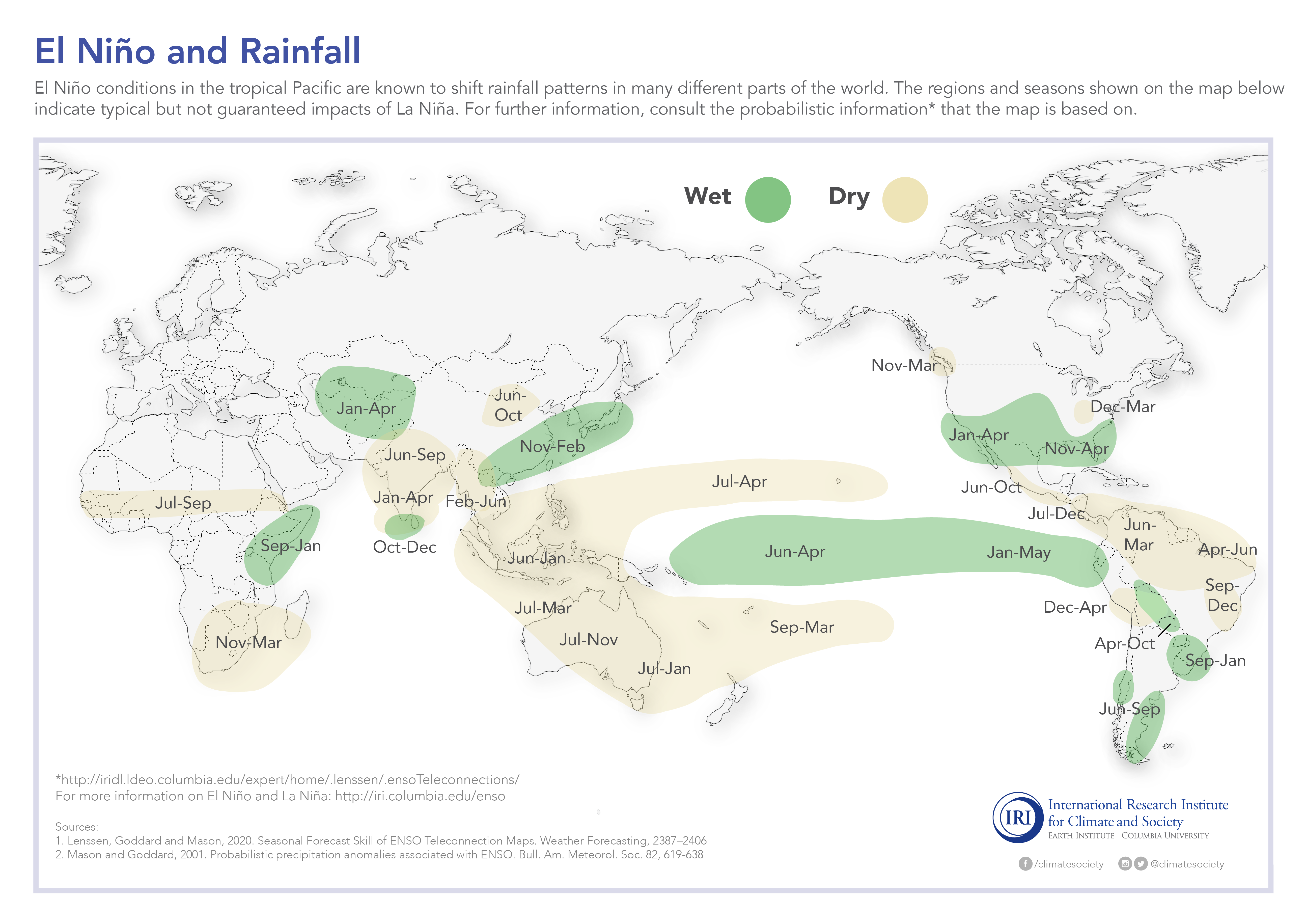
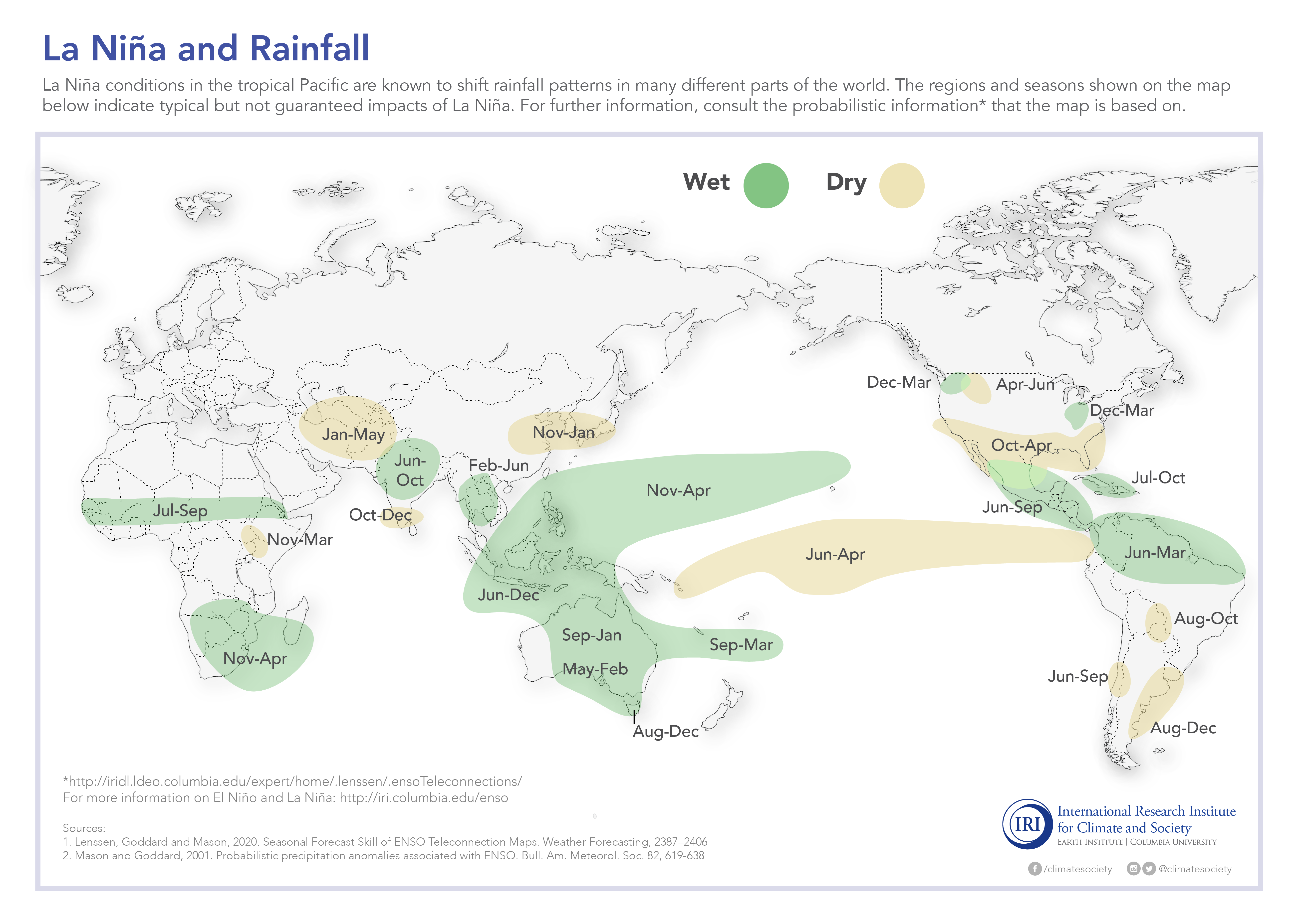
- Past Conditions: These maps show rainfall patterns that can be expected for El Nino, La Nina, and average years.
- Recent Climate Trends: These maps show what the rainfall has been like for the last 100 years, and what trends exist in your location.
This suite of maprooms is financed by IFAD through the “Climate risk management in agriculture with demonstration sites in Indonesia, Lao PDR, and Bangladesh”. The goals of the project are to develop climate information / decision support tools and the capacity required to enable poor rural women and men farmers and policy makers to better manage the risks associated with climate variability and change to increase agricultural production and productivity and enhance food security and rural livelihoods.
Through this project, the International Research Institute for Climate and Society at Columbia University will collaborate with its regional partners at the Centre for Climate Risk and Opportunity Management in South East Asia and Pacific in Indonesia, the National Agriculture and Forestry Research Institute in the Lao PDR, and WorldFish in Bangladesh.


+psdef//antialias+true+psdef//color_smoothing+null+psdef//apcp/0/300/plotrange/S/last/plotvalue//plotborder+0+psdef+.gif)
+psdef//antialias+true+psdef//color_smoothing+null+psdef//apcp/0/300/plotrange/S/last/plotvalue//plotborder+0+psdef+.gif)
+psdef//antialias+true+psdef//color_smoothing+null+psdef//apcp/0/300/plotrange/S/last/plotvalue//plotborder+0+psdef+.gif)


//resolution/parameter/(0.50)/ne/%7B.APHRO_MA_025deg%7D%7B.APHRO_MA_050deg%7Difelse/.precip/T/(1951)//YearStart/parameter/(2007)//YearEnd/parameter/RANGEEDGES/(Jun)//seasonStart/parameter/(-)/append/(Aug)//seasonEnd/parameter/append/3//spellThreshold/parameter/15//wetThreshold/parameter/0.5//minFrac/parameter/(NumWD)//seasonalStat/parameter/(TotRain)/eq/%7Bnip/nip/seastotAvgFill%7Dif//seasonalStat/get_parameter/(NumWD)/eq/%7B3/-1/roll/pop/seasonalfreqGT//units//unitless/def/%7Dif//seasonalStat/get_parameter/(RainInt)/eq/%7B3/-1/roll/pop/seasonalmeandailyvalueGT%7Dif//seasonalStat/get_parameter/(NumDS)/eq/%7BseasonalnonoverlapDSfreq%7Dif//seasonalStat/get_parameter/(NumWS)/eq/%7BseasonalnonoverlapWSfreq%7Dif/dup/%5BT%5Daverage/sub/SOURCES/.IRI/.Analyses/.TS/.AR4/.tas/%5BT%5D1.0/0.0/regridLinear/dup/%5BT%5Dstandardize/exch/2/index/%5BT%5Dcorrelate/mul/1/index/%5BT%5Drmsaover/mul/1/index/%5BT%5Daverage/add/1/index/1/index/sub/T/1/1.0/10/div/butt_filter%3A/%3Abutt_filter/.butt/2/index/2/index/sub/1/index/sub/(Inter-annual)//timeScale/parameter/(Decadal)/eq/%7Bpop/nip%7Dif//timeScale/get_parameter/(Trend)/eq/%7Bpop/pop%7Dif//timeScale/get_parameter/(Inter-annual)/eq/%7Bnip/nip%7Dif/%5BT%5Drmsaover/0/maskle//units/(mm)/def//long_name/(standard%20deviation)/def/startcolormap/DATA/0/256/RANGE/transparent/218/247/218/RGB/210/250/210/RGB/0/VALUE/210/250/210/RGB/160/240/165/RGB/4/VALUE/130/210/135/RGB/8/VALUE/90/190/95/RGB/16/VALUE/yellow/51/VALUE/orange/102/VALUE/red/128/VALUE/magenta/162/VALUE/purple/196/VALUE/MidnightBlue/240/VALUE/MidnightBlue/MidnightBlue/256/bandmax/MidnightBlue/endcolormap/DATA/0/AUTO/RANGE/(Percent%20of%20Variance%20Explained)//timeAnal/parameter/(Percent%20of%20Variance%20Explained)/eq/%7Bdup/mul/exch%5BT%5Drmsaover/dup/mul/1./exch/div/mul//long_name/(variance%20explained)/def//units/unitless/def/(percent)/unitconvert/DATA/0/100/RANGE%7Dif//seasonalStat/get_parameter/(TotRain)/eq/%7B//long_name/(Precipitation)/def//units/(mm)/def%7Dif//seasonalStat/get_parameter/dup/(NumWD)/eq/exch/dup/(NumDS)/eq/exch/(NumWS)/eq/or/or/%7B//long_name/(count)/def//units/(unitless)/def%7Dif//seasonalStat/get_parameter/(RainInt)/eq/%7B//long_name/(Precipitation)/def//units/(mm/day)/def%7Dif/X/Y/fig%3A/colors/black/countries_gaz/%3Afig//antialias/true/psdef//color_smoothing/1/psdef//antialias/true/psdef//plotborder/0/psdef//plotaxislength/432/psdef/+.gif)