Monitoring ENSO

This section contains maps, time series and other analyses useful for monitoring ENSO and identifying the presence of a shift into El Niño or La Niña.

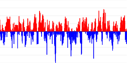
Monitoring of El Niño and La Niña requires observations from both the atmosphere and oceans. These observations are often summarized in terms of various atmospheric and oceanic indices. Some indices are based the absolute departure, or anomaly, from the long-term average of a variable over a region(s). Some of the more common indices in use are found within this section.

There are several regions of the tropical Pacific Ocean that have been highlighted as being important for monitoring and identifying a developing El Niño or La Niña. Referred to as NINO regions, the most common are shown in the figure below:

Longitude x Time
This is a Hovmöller diagram (Longitude x Time) showing five-day running average zonal wind anomalies at 925 hPa averaged over 5°S to 5°N, for the past 120 days, across the equatorial Indian and Pacific Oceans.
This is a Hovmöller diagram (Longitude x Time) showing weekly average outgoing longwave radiation (OLR) anomalies averaged over 5°S to 5°N, for the past year across the equatorial Pacific Ocean.
These analyses include Hovmöller diagrams (Longitude x Time) showing monthly and outgoing longwave radiation (OLR) and sea surface temperature (SST) anomalies and climatologies averaged over 5°S to 5°N, across the equatorial Pacific Ocean, from 120°E to 80°W. Low OLR values in the tropics can be associated with convective cloudiness and precipitation. The climatological analyses illustrate how higher SSTs in the western equatorial Pacific promote increased convective cloudiness and precipitation in that region, both varying in general concert with each other through the course of the year. The anomaly analyses can be used to track the possible development of ENSO conditions in both the ocean and atmosphere by monitoring the extent of anomalous sea surface temperatures and possible corresponding shifts in convective precipitation.
These are Hovmöller diagrams (Longitude x Time) showing either weekly average sea surface temperature anomalies (SSTA) or monthly potential temperature anomalies at depths of 55 and 155 meters, averaged over 5°S to 5°N, for the past year across the equatorial Pacific Ocean. These diagrams can be used to track the evolution and migration of sub-surface temperature anomalies that could contribute to changes in sea surface temperatures in the future in the key NINO regions across the equatorial Pacific used to monitor the development of ENSO.
This is a Hovmöller diagram (Longitude x Time) showing pentad (five-day) running average velocity potential anomalies at 200 hPa averaged over 5°S to 5°N, for the past 180 days across the equatorial Indian and Pacific Oceans.
These are Hovmöller diagrams (Longitude x Time) showing pentad-average, monthly-average, and seasonal-average (3-month) zonal wind and anomalies at 925 hPa, averaged over 5°S to 5°N, for the past year, across the equatorial Pacific Ocean. These analyses may be used to detect changes in the trade winds associated with the development of ENSO conditions. These may also be used to identify, for example, bursts of westerly winds over the equatorial Pacific that may contribute to changes in ocean temperatures that help to trigger or strengthen El Niño conditions.
SST Plots
This map displays the extent of monthly sea surface temperatures for the globe that are 28°C or above for the month indicated, compared to the mean extent for the 1991-2020 base period for the same month of the year.
This map displays the difference in sea surface temperature anomaly from the previous month for the Pacific Ocean.
This map displays monthly sea surface temperature anomalies for the Pacific Ocean.
This map shows the number of months out of the three months indicated in which the standardized sea surface temperature anomaly in the Pacific Ocean exceeded +1 standard deviation or fell below -1 standard deviation of the 1991-2020 mean.
This map shows the number of months out of the six months indicated in which the standardized sea surface temperature anomaly in the Pacific Ocean exceeded +1 standard deviation or fell below -1 standard deviation of the 1991-2020 mean.
This map displays seasonal (three-month) sea surface temperature anomalies for the Pacific Ocean.
This map displays monthly standardized sea surface temperature anomalies for the Pacific Ocean for the month indicated.
This map displays the change in sea surface temperature anomaly from the previous month divided by the standard deviation of the month-to-month change for the given month over the 1950-present base period centered on the tropical Pacific Ocean.
This map displays weekly sea surface temperature anomalies for the tropical Pacific Ocean.
This map displays an animation of weekly sea surface temperature anomalies for the tropical Pacific Ocean over a 20-week period.
Surface Wind
This map displays monthly vector wind anomalies at the 925hPa pressure level over the tropical Pacific Ocean.
This plot displays a time series of pentad (5-day average) zonal wind at the 925 hPa pressure level averaged over the Niño1+2 region, and the 1991-2020 climatology of the same, over the past year.
This plot displays a time series of pentad (5-day average) zonal wind at the 925 hPa pressure level averaged over the Niño3.4 region, and the 1991-2020 climatology of the same, over the past year.
This plot displays a time series of pentad (5-day average) zonal wind at the 925 hPa pressure level averaged over the Niño3 region, and the 1991-2020 climatology of the same, over the past year.
This plot displays a time series of pentad (5-day average) zonal wind at the 925 hPa pressure level averaged over the Niño4 region, and the 1991-2020 climatology of the same, over the past year.
Thermocline
This is a monthly animation over the past year of the equatorial Pacific thermocline, shown as a longitude x depth plot of GODAS potential temperature averaged over 5°S to 5°N, and spanning the Pacific from 121°E to 79°W from the surface to a depth of 350 meters.
This figure is a latitude-depth section of oceanic potential temperature monthly anomalies along the tropical Pacific thermocline at 150°W.
This figure is a longitude-depth section of the difference of oceanic potential temperature monthly anomalies from one month to the next along the equatorial Pacific thermocline.
This figure is a longitude-depth section of oceanic potential temperature monthly anomalies averaged from 5°S to 5°N along the equatorial Pacific thermocline.
This figure displays an animation of a longitude-depth section of oceanic potential temperature monthly anomalies averaged from 5°S to 5°N along the equatorial Pacific thermocline.
This figure is a longitude-time Hovmoller diagram of the monthly standardized anomaly of the depth of the 20°C isotherm in the equatorial Pacific Ocean.
This figure displays time series plots of percentiles of oceanic heat storage seasonal anomalies in the top 300 meters of the central equatorial Pacific Ocean, and percentiles of Niño 3.4 SST monthly anomalies with respect to 1991-2020 base period.
Time Series
This figure displays a time series, in the form of vertical color bars, of the fraction of the area in the equatorial Pacific Ocean from 10°S to 10°N latitude and 85°W to 180°W longitude in which weekly sea surface temperatures are 28°C or greater.
This is a time series of the three-month running average of the standardized Central Equatorial Indian Ocean Index (CEI) -- monthly mean sea surface temperature anomalies averaged over the region 0° to 15°S latitude and 50°E to 80°E longitude.
This is a time-longitude Hovmoller diagram of weekly sea surface temperature, averaged from 10°S to 10°N latitude, across the equatorial Pacific Ocean from 135°E to 85°W, and with time extending from November 1981 to the present.
This plot shows time series of the three-month running average of the Equatorial Southern Oscillation Index (EQ_SOI; in red) and the three-month running average of the Southern Oscillation Index (SOI; in blue) for the past 20 years.
This plot displays three-month running average time series of warm water volume across the east-central equatorial Pacific Ocean based upon the standardized anomalous depth of the equatorial Pacific thermocline, and the standardized NINO3.4 sea surface temperature anomaly from 1982 to present.
This plot displays three-month running average time series of warm water volume across the equatorial Pacific Ocean based upon the standardized anomalous depth of the equatorial Pacific thermocline, and the standardized NINO3.4 sea surface temperature anomaly from 1982 to present.
This plot displays three-month running average time series of warm water volume across the western equatorial Pacific Ocean based upon the standardized anomalous depth of the equatorial Pacific thermocline, and the standardized NINO3.4 sea surface temperature anomaly from 1982 to present.
This is a time series of the three-month running average of the standardized North Tropical Atlantic Index (NATL) -- monthly mean sea surface temperature anomalies averaged over the region 10°N to 20°N latitude and 79°W to 20°W longitude.
On this plot are time series of the three-month running average of the standardized North Tropical Atlantic Index (NATL) (dotted line; monthly mean sea surface temperature anomalies averaged over the region 10°N to 20°N latitude and 79°W to 20°W longitude), the three-month running average of the standardized NINO3 index (dashed line; monthly mean SST anomalies averaged over the region 5°S to 5°N latitude, 150°W to 90°W longitude), and the standardized difference between NATL and NINO3 (solid red line; NATL minus NINO3).
These are time series of the three-month running average of standardized anomalies of the monthly zonal wind at 925 hPa averaged over the equatorial Pacific Ocean (5°S to 5°N latitude and 150°E to 90°W longitude) and the three-month running average of standardized anomalies of monthly sea surface temperature anomalies averaged over the NINO3.4 region in the equatorial Pacific (5°S to 5°N latitude and 170°W to 120°W longitude) over the past 25 years.
This figure displays a time series, in the form of vertical color bars, of the monthly standardized Southern Oscillation Index (SOI) from January 1951 to present.
This figure displays a time series of the five-month running average of the standardized Southern Oscillation Index (SOI) from January 1951 to present.
This is a longitude-time Hovmoller diagram of standardized sea level pressure anomaly, averaged from 5°S to 5°N latitude, across Indonesia and the equatorial Pacific Ocean from 90°E to 80°W, over the past two years.
This is a map of monthly tropospheric temperature anomaly in the global tropics, averaged from 850 hPa to 200 hPa.
This plot displays time series of the three-month running average of standardized tropical tropospheric temperature anomalies (in blue) and the three-month running average of standardized Niño 3.4 sea surface temperature anomalies (in red).
This is a longitude-pressure section of monthly tropospheric temperature anomaly, averaged from 25°S to 25°N latitude, plotted across all longitudes, and from 850 hPa to 200 hPa.
Tropical Atmospheric Circulation
This is a map of seasonal (3-month) CAMS-OPI precipitation anomaly from the long-term mean, and seasonal-average standardized streamfunction anomaly (select from 925 hPa and 200 hPa pressure levels) over the tropical Indian and Pacific Oceans.
This is a map of seasonal (3-month) CAMS-OPI precipitation anomaly from the long-term mean, and seasonal-average standardized velocity potential anomaly (select from 925 hPa and 200 hPa pressure levels), and the divergent part of the wind (vectors) over the tropical Indian and Pacific Oceans.